
Is it Time to Redesign Your Website? 5 Sure Signs
So you spent all this money on a brand new website that was great, you were happy and you thought you were done. That was 5 YEARS AGO. Sorry, but the fact is, that is a lifetime in the online world. It may have served you well for a while, but chances are, that once state-of-the-art website is now obsolete. It is most likely time for you to consider an update.
Your old site could even be doing you more harm than good. First impressions are everything. People today are quick to judge a company’s credibility based solely on their web presence. Your website better look professional and work smoothly, immediately, or they are gone. Their expectations of a great user experience are growing higher by the day. It is more important than ever to keep up with the constantly advancing technology and evolving trends that exist online or you’ll be left in the dust.
So how do you determine if your website is due for a makeover? Here is a list of clear-cut signs to help you decide.
1. You Can’t Easily Make Updates
You’re probably wasting time and money by continuing to make updates to your old static site when it is way more efficient to have your website built on a new, well supported content management system (CMS) such as WordPress. You just want the ability to make a quick blog post, list an important event or sale, or simply change some copy on your site but you have to either know some coding language or involve your web development team to do it for you. Well your content has to be easier to manage and update than that. It is also very important in terms of SEO practices for you to add that fresh content to your site frequently. A CMS platform allows clients to log in to their own site through a web browser and make instant changes anytime. Beyond content updates, it is easy to add an endless supply of new features to your site with all the innovative widgets and plugins that are available. Additionally, the updating of the content management system itself can keep your site safe from hacking and security breaches.
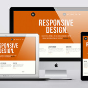
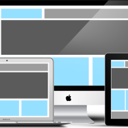
2. Your Website Design isn’t Responsive
Does your website present an excellent viewing experience on any device, from a desktop computer or laptop to a tablet or mobile phone? Do visitors have to zoom, pinch, and pan their way around the full desktop version of your site on their smartphone? This is clearly not the way to please your customers in today’s mobile dominant world. When people use the internet on their smartphone, it’s often because they have an immediate need for something. When they find it quickly, it usually leads to further engagement – a call, email, more research, even a purchase. It is essential for your website to deliver a user-friendly mobile browsing experience that makes everything easy for potential customers. Websites developed using responsive design are able to adjust and organize their flexible content to fit the screen of any device, providing the optimal view. Appropriately, Google’s search algorithm loves responsive designed websites. Check out our more in depth article on the subject for more facts regarding the importance of responsive design.
3. You Don’t Know if Your Website is Getting Results
Some people think that a week after launching their website it should appear at the top of the Google search results for every keyword they try. Good luck. If the content on your website wasn’t carefully planned out and written with current SEO conventions in mind, then the odds are strongly against you. Your site doesn’t just need to rank well in Google search results but also generate leads and good conversion results. You not only need a strategy to improve your rankings and drive traffic to your website, you need to then keep visitors there and seize the opportunity. Resolving high bounce rates is a key reason for having a detailed measure of your website analytics. If your website has no way to track these user tendencies, then it’s time to put a method in place. It is imperative for any business to calculate it’s return on investment. Read more about SEO tactics that should be integrated into your site to get the results you need.
4. It Looks Outdated
Are you embarrassed to give out your web address? I can’t stress enough the importance of a good first impression. You really only have a few seconds to grab their attention before a user has decided whether to continue using your site. From the very first time a visitor interacts with your website, your brand, they have to get a positive feeling. The validity of your company relies on it. If your competitor’s site looks newer and better, they have an immediate advantage. Design trends and technology are changing all the time. Today’s web design trends call for a clean, fresh look with simple navigation. Newer sites are using crisp graphics and icon sets, big professional photography, and better content organization methods. These certainly aren’t characteristics of sites designed even just a few years ago. If your website is still using Flash to create some animation or interactive features, then it is definitely time to change. That 3 minute animated intro with sound effects is no longer fun or interesting and it’s a sure bet to lose traffic. Flash is no longer supported, it’s a security risk, and horrible for SEO. There is new technology available to add that bit of sizzle and more.
5. You’ve Outgrown Your Website’s Capabilities
Parts of your aging site just aren’t working anymore and it isn’t worth the time or money to fix the problems. It’s probably a signal that you’re due for an overhaul. You might be able to stick a band-aid on and limp along for a little longer but it isn’t going to be pretty and it isn’t a long term solution. Maybe your company is expanding or going in a different direction and your current design or platform isn’t flexible enough to incorporate the additions or changes. Maybe your site isn’t capable of integrating e-commerce or even social media. A new responsive website using a good content management system provides the proper base that allows for tremendous growth. The brilliant developers behind these systems are producing cutting edge add-on tools every day that account for any feature you can think of. It is far easier and more seamless to build your site the right way with these new tools.
There are quite a few factors to consider when deciding to redesign now or wait. Everyone’s main question is, “How much will it cost?” A website is the most valuable marketing tool your business can invest in. The investment isn’t just in a cool looking new site, it’s about optimizing performance and ultimately increasing sales. If you’ve gone over 5 years without a redesign, you might already be spending too much on updating your current site. GCP would be happy to take a look and discuss the ways you can benefit from a redesign.