50 Essentials For Every Small Business Website

A good website is an undeniable necessity for any business these days. They come in all shapes and sizes with a huge variety of options and features to choose from. Large corporations with massive budgets can have a website developed with all the bells and whistles. However, as a small business owner with more limited funds it is important to focus on the elements your website absolutely must have. Many don’t really know what they actually need to succeed.

From the very basic essentials to the more technical functions, the detailed infographic below (source: 99MediaLab) which highlights the components of an effective small business website. Does your website measure up? If not, GCP can help implement a design and marketing strategy for your small business that covers all your needs.

50 features small business websites
 

infographic source: 99MediaLab

Maps Directories Local SEO

Put Your Business on the Map: The Importance of Directories and Local SEO

There was a time when people reached for their copy of the Yellow Pages when they were in search of a local service or product. Your business had to be listed in it or you were missing out on potential customers in your area. Those days are long gone and printed business directories are tools of the past, as most of them go straight in the trash without ever being used. They had a good run and the right idea but in today’s digital world, all those big directory companies have shifted to providing that information in their online directories. For businesses that service specific regions, it is crucial to expand your optimization efforts beyond your website and invest time in creating a presence in these local directories, maps, and review sites. Google’s latest algorithm updates have been giving more and more prominence to local map and directory websites, often ranking them even higher than the business’ own website. It is initially very likely that more customers will be exposed to your business through these sites than your actual website simply due to their position at the top of search results. So just like before, it is essential for your business to be registered in these local listings or you will miss opportunities.

When you put your business in a directory, you aren’t simply providing your address and phone number anymore, you are increasing your overall visibility and letting people instantly engage with your business as well. There is a very interactive and even social experience served up that supplies a business description, map location & directions, operating hours, website & social media links, photos & videos, ratings and reviews from previous customers, and more. Appearing on the map that displays upon searching is one of the most important of these results. When someone needs information NOW, they reach for their smart phone that is pre-loaded with mobile apps like GPS, Apple Maps, and Google Maps which pulls in all the aforementioned local business information from Google My Business. On the go, a quick search will give them all the information they need and do so immediately. The consumer reviews that are integrated are another extremely important factor in how your business is being presented. Your customers now have an extra channel for determining your reputation. It is critical to not only make certain the listed contact information is accurate and consistent but to also monitor feedback and gather positive reviews. Maximizing your exposure in big online map sites and local directories like Yelp, Google My Business, Yahoo Local, Bing Local, TripAdvisor, and even smaller, well-optimized, locally focused niche sites will guarantee that your business is at their fingertips. Every individual directory you submit to is another chance to be found.

Adding these local efforts to your overall SEO strategy will drive awareness and increase the visibility of your business in just a few steps. From there, you can continue to optimize your listings and build fresh content to stand out even more by adding details and new photos, creating special deals, responding to reviews, and more. Get started and grow your local business today!

Social Media Marketing

What Auto-Posting Does & Why it’s Important to Social Network Marketing

Auto-Posting allows you to publish posts from your blog to your Social Network accounts such as Facebook, Twitter, Google+, Pinterest, YouTube, etc. The whole process is completely automated. Simply write a new post and either the entire post or it’s nicely formatted announcement with backlink will be published to all of your configured social networks automatically. You cover exponentially more ground and create that many more ways for new prospects and search engines to find your website without extra effort. You can reach the most audience and tell all of your fans, readers and followers about your new post. Your messages are 100% customizable and adopted for each network requirement. Scheduled Auto-Posting allows you to organize your time efficiently and deliver your messages most effectively, exactly when you arrange them to occur. You may not have an army working on your social media marketing, but with Auto-Posting you become an army of one. No serious website should be left without it.

Identity Branding

What is Branding and Why is it Important?

Your brand is one of your company’s most valuable commodities. It goes way beyond a cool logo, catchy jingle, or memorable tagline. The brand is a total customer experience that should be the foundation upon which your entire organization is structured and developed from day one. A lot of smaller companies fail to understand the impact of a cohesive, long term brand strategy and carelessly neglect spending the time to focus on one. It should be an ongoing high priority, not an afterthought that results in a scattered, wavering effort. Your branding shapes your reputation, credibility, and the feeling people get about your product or service. If it isn’t implemented and maintained correctly it can be a real hindrance to your company and the way it is perceived.

Here are 5 ways good branding can help your business:

1. Makes You Unique

Chances are, you aren’t the only one out there doing what you do or selling whatever you sell. It is essential to stand out from the crowd and find a way to motivate customers to choose you over your competitors. To make it even harder, due to the internet you may actually be competing globally. Distinguishing yourself and leaving a positive impression, both visually and emotionally, can give you the edge you need. Original, unforgettable branding that successfully projects your incomparable benefits will set you apart.

2. Creates Focus

Every company needs to have a vision, a mission that the entire organization can aim for together. A comprehensive brand with tight standards in place can guide all your marketing efforts into alignment. When employees are all on the same page with the same goal in sight, bad individual decisions are decreased and desired outcomes are achieved.

3. Helps You Connect

You want people to feel good when they buy your brand. With everyone reviewing your product or service online these days, a good experience can go a long way. Customers are more comfortable when they know what they’re going to get and tend to do business with companies they are familiar with. When you can consistently fulfill their expectations, you gain their trust and their repeat business. This in turn prevents new competitors from stealing them away as loyal customers are less likely to switch.

4. Generates Referrals

You always want to be attracting new customers as well. There is no easier way to draw attention than letting others do it for you. When your friends love a certain brand, they are walking advertisements for it. They wear it with pride and can’t wait to show it off, introduce you to it and essentially sell you on why it’s the best. These word of mouth peer endorsements are crucial for a brand to gain momentum and go viral. Furthermore, if a brand is lucky enough to garner the influence of celebrity endorsements the outreach can spread tremendously.

5. Assigns More Value

A growing brand can create a value that far exceeds actual physical value. Good brands build persisting emotional relationships with consumers who love and remain loyal to their products. The following that evolves helps to spread a sense of quality and belief in the superiority of the company. That prestige justifies charging more and people will proudly pay a premium for something they think is better. Branding is selling. Once devoted attachments are made to a particular brand, it guarantees future business which increases inherent value.

Where to Start:

Define Yourself and Your Target Audience

You can’t be everything to everyone. Are you the innovative, young start-up or the experienced, mature firm? Are you the high quality, expensive option or the common, bargain choice? What do customers want from you? Do some homework, have some analytics in place to learn their habits and cravings. Realizing your true identity and determining a clear target early on will create a more efficient directive instead of wasting resources by casting a wide net and hoping.

Create Your Face and Voice

A great, memorable logo is the primary component of your brand. It’s the probably the first thing people are going to see and it needs to make a good impression. Sorry but that free clip-art you found online or that sketch from your teenage daughter is not going to cut it. Nor is your tired tagline that states “For all your (insert trade) needs”. Bite the bullet and work with a professional designer to perfect your visual identity and motto that captures and communicates the essence your brand. Then use it to get the word out. Leverage social media. Plaster it everywhere – all promotional materials, advertising, packaging, website, correspondence, internally and externally – every single place is an opportunity to increase awareness.

Be Consistent

Control and protect the brand with strict Brand Standards for all your marketing materials. Publish guidelines for logo usage, color palettes, typography, taglines, and any other brand principles or restrictions you wish to establish. Hundreds of different, mutilated versions of your logo will spread across the internet and mar your brand if you let it. Consistency is imperative for making your mark memorable and long lasting.

Integrate Your Brand

The brand you develop should permeate every aspect of your business, not just outwardly but internally as well. Company policies and practices should be spelled out to provide direction and create unity among the staff. If your employees believe in the brand, it will resonate. How they act, what they say, what they wear, all represents your company just as much as your commercials or social media announcements. In today’s connected world, even your political, environmental or cultural views and affiliations can have a big impact on your business. Everything you put out there is your brand. Make sure everyone is delivering the right message.

GCP has been building brands for 20 years. We can help create and manage your new brand or reinvent your existing one. Take a look at some of our recent branding solutions.

Website Design

Is it Time to Redesign Your Website? 5 Sure Signs

So you spent all this money on a brand new website that was great, you were happy and you thought you were done. That was 5 YEARS AGO. Sorry, but the fact is, that is a lifetime in the online world. It may have served you well for a while, but chances are, that once state-of-the-art website is now obsolete. It is most likely time for you to consider an update.

Your old site could even be doing you more harm than good. First impressions are everything. People today are quick to judge a company’s credibility based solely on their web presence. Your website better look professional and work smoothly, immediately, or they are gone. Their expectations of a great user experience are growing higher by the day. It is more important than ever to keep up with the constantly advancing technology and evolving trends that exist online or you’ll be left in the dust.

So how do you determine if your website is due for a makeover? Here is a list of clear-cut signs to help you decide.

1. You Can’t Easily Make Updates

You’re probably wasting time and money by continuing to make updates to your old static site when it is way more efficient to have your website built on a new, well supported content management system (CMS) such as WordPress. You just want the ability to make a quick blog post, list an important event or sale, or simply change some copy on your site but you have to either know some coding language or involve your web development team to do it for you. Well your content has to be easier to manage and update than that. It is also very important in terms of SEO practices for you to add that fresh content to your site frequently. A CMS platform allows clients to log in to their own site through a web browser and make instant changes anytime. Beyond content updates, it is easy to add an endless supply of new features to your site with all the innovative widgets and plugins that are available. Additionally, the updating of the content management system itself can keep your site safe from hacking and security breaches.

2. Your Website Design isn’t Responsive

Does your website present an excellent viewing experience on any device, from a desktop computer or laptop to a tablet or mobile phone? Do visitors have to zoom, pinch, and pan their way around the full desktop version of your site on their smartphone? This is clearly not the way to please your customers in today’s mobile dominant world. When people use the internet on their smartphone, it’s often because they have an immediate need for something. When they find it quickly, it usually leads to further engagement – a call, email, more research, even a purchase. It is essential for your website to deliver a user-friendly mobile browsing experience that makes everything easy for potential customers. Websites developed using responsive design are able to adjust and organize their flexible content to fit the screen of any device, providing the optimal view. Appropriately, Google’s search algorithm loves responsive designed websites. Check out our more in depth article on the subject for more facts regarding the importance of responsive design.

3. You Don’t Know if Your Website is Getting Results

Some people think that a week after launching their website it should appear at the top of the Google search results for every keyword they try. Good luck. If the content on your website wasn’t carefully planned out and written with current SEO conventions in mind, then the odds are strongly against you. Your site doesn’t just need to rank well in Google search results but also generate leads and good conversion results. You not only need a strategy to improve your rankings and drive traffic to your website, you need to then keep visitors there and seize the opportunity. Resolving high bounce rates is a key reason for having a detailed measure of your website analytics. If your website has no way to track these user tendencies, then it’s time to put a method in place. It is imperative for any business to calculate it’s return on investment. Read more about SEO tactics that should be integrated into your site to get the results you need.

4. It Looks Outdated

Are you embarrassed to give out your web address? I can’t stress enough the importance of a good first impression. You really only have a few seconds to grab their attention before a user has decided whether to continue using your site. From the very first time a visitor interacts with your website, your brand, they have to get a positive feeling. The validity of your company relies on it. If your competitor’s site looks newer and better, they have an immediate advantage. Design trends and technology are changing all the time. Today’s web design trends call for a clean, fresh look with simple navigation. Newer sites are using crisp graphics and icon sets, big professional photography, and better content organization methods. These certainly aren’t characteristics of sites designed even just a few years ago. If your website is still using Flash to create some animation or interactive features, then it is definitely time to change. That 3 minute animated intro with sound effects is no longer fun or interesting and it’s a sure bet to lose traffic. Flash is no longer supported, it’s a security risk, and horrible for SEO. There is new technology available to add that bit of sizzle and more.

5. You’ve Outgrown Your Website’s Capabilities

Parts of your aging site just aren’t working anymore and it isn’t worth the time or money to fix the problems. It’s probably a signal that you’re due for an overhaul. You might be able to stick a band-aid on and limp along for a little longer but it isn’t going to be pretty and it isn’t a long term solution. Maybe your company is expanding or going in a different direction and your current design or platform isn’t flexible enough to incorporate the additions or changes. Maybe your site isn’t capable of integrating e-commerce or even social media. A new responsive website using a good content management system provides the proper base that allows for tremendous growth. The brilliant developers behind these systems are producing cutting edge add-on tools every day that account for any feature you can think of. It is far easier and more seamless to build your site the right way with these new tools.

There are quite a few factors to consider when deciding to redesign now or wait. Everyone’s main question is, “How much will it cost?” A website is the most valuable marketing tool your business can invest in. The investment isn’t just in a cool looking new site, it’s about optimizing performance and ultimately increasing sales. If you’ve gone over 5 years without a redesign, you might already be spending too much on updating your current site. GCP would be happy to take a look and discuss the ways you can benefit from a redesign.


5 Practical Trends in Web Design Today

Among the millions of unique web designers and developers worldwide with different technical backgrounds and artistic preferences exists some common design elements that are dominating the online landscape. You may have already noticed most new websites published today are conforming to some of these characteristics. The similarities don’t happen because web designers are all copycats but rather because they are proven to work. These techniques combine the best of both form and function to help shape great websites. They are also products of the rapidly evolving responsive and mobile environment that will certainly continue well into the future. Let’s take a look.

1. Long Scrolling

As mobile browsing on small screens continues it’s dominance, the old “above the fold” mentality has died. Long scrolling is not just trendy but practical. Home pages, news feeds, and product pages particularly benefit from the ability to display and organize a lot of continuous content instead of linking from page to page. From storytelling to chronological arrangements, long scrolling enhances the overall experience. Providing more interaction with the information and presenting new visuals or slick animations throughout the navigation also keeps the user interested. It’s presence on every social media site should give you an idea of it’s popularity.

2. Sticky Navigation

Often working in conjunction with the long scrolling website is the popular usage of a “sticky” navigation menu that stays in place on the screen, available for immediate access at any time. The user should never get lost on a page or have to scroll back up a mile to the top to get to the menu. Anyone who has ever used a phone or tablet app should also now recognize the familiar “hamburger” icon, three stacked horizontal lines, which reveals the full menu when pressed. Some minimalist designers are using this more app-like navigation approach on the desktop view of their sites instead of only on smaller viewports.

3. Minimalism

One of the fashionable web design choices is actually an old philosophy, keep it clean and simple. Minimalism is seen everywhere online today. Busy, over-designed, super-colorful sites can be very confusing, information overload. Removing non-essential distractions and presenting simplicity with clear, crisp copy is a better solution for many brands and campaigns seeking more elegance. Minimalism works great in today’s responsive design environment due to it’s flexibility and lightweight, quick-loading layouts and can even be combined with the other design techniques on this list.

4. Large Images

Huge, high quality, professional photography filling the entire screen is one of the most embraced trends seen today. The use of massive images in combination with minimalism or a concise call to action demands a user’s attention. Having one concept per page or screen, centered around a single visual, is a compelling way to keep them engaged and focused on your message. This method is generally being used up front and in your face immediately on home pages. It is often continued as you scroll down to organize different concepts into screen-sized sections which helps by presenting more digestible bits of information at a time. A related popular trend is using parallax graphics, large background images moving at different speeds as you scroll to create a more enjoyable visual interaction.

5. Large Typography

Making a dramatic statement that can’t be missed is important. People read the biggest words on a page first. Staging messages with large, attention grabbing headlines has really caught on. The easier and quicker it is to read, the better. Large typography is especially successful in minimalist designs and scrolling sites where concepts are presented in sections at a time. Furthermore, it plays a key role on responsive websites where the message needs to work regardless of screen size. Huge white type used over full screen photos is also a trend within itself seen all over the internet.

These are just a few of the more prominent design features that are out there in web design today, and for good reason. They have purpose beyond aesthetics and probably more staying power than other “trends”. Keep your website up to date with these practices and you’re sure to impress.

Responsive Design

Don’t Be Left Behind: The Importance of Responsive Design

The times of desktop dominance are over, mobile is now the digital leader. Studies show that smartphones and tablets today account for over 60% of time spent online. With mobile devices taking over our daily lives, that percentage will only continue to rise. This should be no surprise. Just look around and you’ll see how many people are glued to their phones. Now more than ever, it is crucial for your website to be designed on a platform capable of displaying your products or services to these people, these potential customers. If your website doesn’t work for them on your phone, your business doesn’t exist, sales are lost and you’re left behind.

It’s time to adapt. Responsive design is the answer. It’s not a trend, it’s a necessity. It doesn’t just mean that your site looks pretty on an iPhone or a tablet. When your website is built on a responsive design platform, your exact same content and images adjust fluidly across all devices and screen sizes. You can maintain one consistent, adaptive website instead of multiple versions of your information and SEO campaigns. It also allows your business to keep the same look, feel, and branding everywhere it’s seen. Ease of use on a mobile device has become an absolute expectation for customers these days. No one is going to endure zooming, pinching, and squinting their way through your website. The total browsing experience, easy navigation and superior usability of responsive design keeps them on your site instead of leaving out of frustration. Make it easy for them to do what you want them to do, and they will.

Beyond all the maintenance, flexibility and usability benefits, and maybe more importantly, is the SEO impact that is drastically improved by a site’s responsiveness. Keeping your website visible is vital. Simply, your website has to be easy to find when searched for. Google has established a clear stance on their search engine’s preference for responsive websites. Google says it’s more efficient to crawl and index your content when it’s in one place on one URL. Furthermore, Google gives advantage to sites that use CSS media queries defining the way the content renders on different mobile devices. These are both key features of responsive design.

With the abundance of future devices and constant innovations, from huge HD smart TVs to tiny screen wearables, responsive design is more important than ever. The digital environment is always developing and changing, your site needs to work with it. If you haven’t already taken the steps to get your website up to date, now is the time to change.

Search Engine Optimization (SEO) – What is it?

Search Engine Optimization (SEO) is a key internet marketing strategy that involves optimizing the visibility of a website in a search engine’s “natural” or un-paid (“organic”) search results. SEO considers how search engines operate, what people search for, the actual search terms or keywords typed into search engines and which search engines are preferred by their target audience. Optimizing a website ,Search engine optimization (SEO), is a process that is best performed by a professional SEO Service provider that practices and follows Google’s Good Practice rules for Webmasters and expertise that will include a number of good practice internet marketing strategies such as :

  • Keyword Research
  • Technical Site Optimization
  • Design Optimization
  • Local Search Optimization
  • Content Optimization – Content, Image Search Optimization, & Product Search Optimization
  • Rich Snippet Structured Data & Schema Coding Optimization – Essential for Google
  • Sitemaps
  • Submissions to Search Engines


responsive website design

Responsive Website Design – What is it?

Responsive website design – What is it?

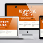
Responsive website design  allows yours website to be built to provide an optimal viewing experience—easy reading and navigation with a minimum of resizing, panning, and scrolling—across a wide range of devices. It optimizes the experience and viewing on mobile devices, smart phones, tablets, or a desktop and is compliant with all the latest Browsers and standards.

Responsive website design allows your website to adapt to screens on these devices. The website layout changes based on the size and capabilities of the device. For example, on a phone, users would see content shown in a single column view; a tablet might show the same content in two columns, etc..

Fresh New Site & Logo

Announcing the launch of the new and improved GCP Design & Marketing website and company logo.